Final designs
Monday, 30 June 2014
Monday, 23 June 2014
Research Pages on Three Charities
NSPCC
This is their logo:

Using their evidence-based research into reducing harm to children, they commission new services.
We then measure the service carefully to ensure that it works. If it does we tell others, in order to make sure that these new ideas and services are taken up by them to help other children.
The NSPCC have also created ChildLine. This is a charity that helps people through talking on the phone. It has helped many young people (especially teenagers apparently) to deal with their stress and problems.
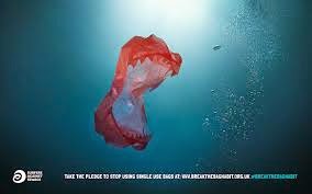
These are a few examples of their posters promoting their charity:
 In this image, it shows a contrast. It helps you realize that you can switch from one thing to another. It also helps that she looks happy, because her smile is one of the first things that you notice. Also, the text stands out and there are two sentences that are enlarged and bold. "Later she" and "Hold a pillow" The word later shows a difference in time and the second sentence shows power and the child being helpless because holding something doesn't take a lot of effort.
RSPCA
The RSPCA are a charity harassed on animals. Their vision is to end animal cruelty and to help animals not be in distress. They "speak up" for the animals because they do not have a voice and do so through their campaigns.
They were founded by three people called: Arthur Broome, William Wilberforce and Richard Martin in 1824.
This is their logo:

Through investigations and prosecutions, they stand up to those who deliberately harm animals to send out a clear message - Animal abuse is wrong
Their highly trained officers tackle neglect and cruelty at every level and are working hard to stamp out large-scale serious, organised and commercial animal cruelty.
These are a couple of their posters:

In this image, they have used cartoon and poem styled text. They have enlarged a few images that children are more likely to recognize, like the dog food, and have used very little text and short lists regarding something they need. This advert is more likely to appeal to children due to the child like feel that the cartoon images give off.


This advert is aimed at everyone. Despite it being a cartoon,the image has a frame and a very serious message. They have also used a real life scenario, despite the cartoon drawings, so it is more believable. This would appeal to children because of the bright colours and bold text. It would appeal to adults because of the word "HELP" which shows a cry for help. Being an adult, you generally want to help. To add, they have probably used a cartoon dog on the basis that next to no one would want to look at an actual dog dying in a car.
Surfers Against Sewage
The charity was established in 1990 by a group of passionate, local surfers and beach lovers in the North Coast villages of St. Agnes and Porthtowan The organization swiftly created a national movement calling for the improved water quality in the UK. Another aim of theirs is to make the back and sea a suitable place for people to surf and enjoy. Some of the issues they raise are: Climate change, toxic chemicals and shipping.
Their logo is:

Surfers Against Sewage is a vocal and effective campaigning force at the Cleaner Seas Forum and the Green Seas Partnership, and consistently highlights water quality issues through these vital meetings, lobbying government and industry for improvements to protect the coastal environment and recreational water users.
The issue of water quality and the health risks associated with bathing in polluted waters are also highlighted consistently in the mainstream media, from the Sunday Times to Panorama, the One Show to local news bulletins.
These are some of their posters:


Monday, 9 June 2014
Mono Printing


Tuesday, 27 May 2014
~Half Term Homework~
Nelson Makamo mono prints:
The mono prints created by Nelson Makamo are very different. They are also very dark. It appears to me that he sets them with a black background and then he has added the detail with white.
I like this because it is different and draws you in more. I also like it because it breaks the rule that everything should be colourful. Another aspect of his work is the slight contrast of colours, shown in this example with the glasses and outline of shirt.
These are my prints like it:
Monday, 19 May 2014
Andy Warhol Style images

First, I added a photo of my inspiration. I did this by dragging an image that I'd saved to my desktop into photoshop.

I then created a copy of this and worked on it.

On the background copy, I turned it into black and white my hovering over the "Image" tab and selecting adjustments. This then came up with options and I chose black and white.

I repeated the previous step but selected the "Threshold" button instead.

I then changed the threshold to 80 and then used this to edit.

With the magic wand tool, I could select more than one section of the image when I was holding shift. I selected these and clicked on the colour changing button at the bottom.

I changed the colour to a mintish green. I then selected the bucket tool.

I changed the background with the paint bucket tool and created the Warhol style background.

I repeated the process with the magic wand and the changing colour step. I then exiled in the rest of the image.

I then flattened the image and added it to a blank A4 file.

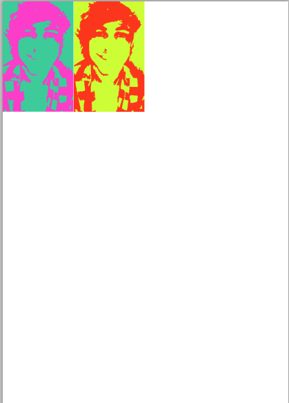
I repeated all the previous steps to create the second image and am continuing to repeat this.
Tuesday, 13 May 2014
Andy Warhol Research Page
Information about Andy Warhol:

Born on August 6, 1928, his parents, Ondrej Warhola and Julia Warhola were immigrants from Slovakia. He was born and grew up in the neighborhood of Oakland in Pittsburgh, Pennsylvania. Andy Warhol was a successful magazine and ad illustrator who became a leading artist of the 1960s Pop art movements. He ventured into a wide variety of art forms, including performance art, filmmaking, video installations and writing, and controversially blurred the lines between fine art and mainstream aesthetics. Warhol died on February 22, 1987, in New York City.
Examples of his artwork:
 |
| This is an example of Ingrid Bergman; The Hat created by Andy Warhol |
 |
| This is an example of what he did in his first job, advertising. |
 |
| This is an example of his work called "Jackie" |
 |
| This is potentially the most famous Warhol piece. It is of Marilyn Monroe
The reasons behind most of the art work Andy Warhol created is only known by him, however I'd guess that the photos that he created of people were to symbolize their importance to the era. For example, Marilyn Monroe was a massive icon in the 1950's, so Warhol decided to paint her.
In my opinion, I think that Andy Warhol's work was an amazing step forward in art. It is different, colorful and has become a style of art. I also think that it is hyped up too much, however it did help the art world to move on to accepting different art as well as traditional.
Facts about Andy Warhol:
1. A devout Roman Catholic, Warhol attended mass daily.
2. The blank right-hand side of Warhol's Silver Car Crash (Double Disaster) mimics the breaking of a strip of projected film and the loss of consciousness upon death.
3. In 1964 the Castelli Gallery showed Warhol's Flowers series, a theme the artist selected in part because the art dealer Ileana Sonnabend sensed New York collectors' resistance to his early Death and Disaster paintings, which had been more popular in Europe.
4. Warhol started to paint depictions of Elizabeth Taylor when the actress got sick while filming Cleopatra and the artist believed she might die.
5. Warhol struck upon series paintings as a way to draw attention at galleries, and to distinguish himself from fellow Pop figure Roy Lichtenstein.
6. Warhol's modest family roots influenced his work: it's thought his mother's choice of lunchtime staple prompted his Campbell Soup series.
7. In 1962, a first solo show in New York featured Warhol's earliest depictions of Marilyn Monroe – and sold out.
8. The Factory had three locations; the original site was called the Silver Factory thanks to walls covered in foil and metallic paint.
9. Warhol had long had premonitions of a violent death, which almost came to pass when Valerie Solanas shot and nearly killed him.
10. After Warhol was shot, he made works in which he figured as a living symbol of death, including self-portraits with skulls photographs by others his scarred body.
11. Paparazzo Ron Gallela was Warhol's favourite photographer.
12. Gallerist Anthony d'Offay found some of Warhol's Fright Wig self-portraits to be so disturbing the dealer would not display them.
13. 210 Coca-Cola Bottles was the first Warhol work to pass the $1-million mark at Sotheby's, hammering down at $1.4 million on 2 May 1988.
14. Warhol's 1988 estate sale at Sotheby's netted $25 million for the then-fledgling Andy Warhol Foundation for the Visual Arts – including nearly $250,000 for Warhol's collection of 175 ceramic cookie jars.
15. In November 2009, 200 One Dollar Bills became the top-selling Warhol work ever auctioned at Sotheby's, fetching $43.8 million, more than three times the high estimate of $12 million.
16. Warhol originally painted Double Elvis (Ferus Type) in 1963 for a show at the Ferus Gallery in Los Angeles, where director Irving Blum cut and stretched the canvas himself.
17. Because of their scarcity and the tragedy and glamour of their topic, canvasses in Warhol's Marilyn seriesare among the artist's most coveted.
18. In 2010, a 1986 purple Self-Portrait set the record for Warhol self-portraits when it sold for at Sotheby's for $32.6 million.
19. Of the four largest canvasses in Warhol's Death and Disaster series, one is featured in the Contemporary Art Evening auction; the other three belong to prestigious museum collections.
20. Warhol likened his process of executing silk-screened canvasses to the workings of a machine.
|
Tuesday, 29 April 2014
Observational Drawing
 |
| This is the photo that I drew from the computer screen. |
 |
| This is the photo that I chose to go over with a black permanent marker and a clear sheet. |
 |
| This is the result after I'd gone over the photo and took the photo away. |
Hannah Hoch - Self Review
What have we learnt in today’s lesson?
In the lessons that we have been doing, I have learnt that media can be shown in many different ways, including posters where you work out the message behind it yourself.
What does mixed media mean?
What technique have we learnt
we have learnt that you can show a message through newspaper pieces and selected photos
How have you created tone into your collaged sections?
I have used different colours that make certain parts of the paper look darker or lighter.
What magazine page have you used to create the different patterns, textures?

Hanna Hoch work
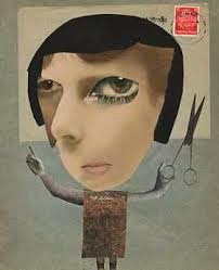
These are the examples I created that were inspired by Hannah Hoch:
 |
This one is based on materialism |
 |
This one is based on global warming |
I think that I have shown that this is inspired by Hannah Hoch because I have used news paper cut outs and stuck them down with PVA glue. Also, I have tried to link things together and make certain items look distorted and unusual.
Hannah Hoch - Research Post
Who was Hannah Hoch?
Hannah Hoch was a pioneer of the art that in later years came to be known as Photomontage. She was born in Germany. She was born in Gotha, one of the largest cities in Germany.
She went to study glass design and graphic arts, in order to please her father, apposed to choosing fine arts. Then, WW1 started, so she came back Gotha and stopped school to come back and help with the Red Cross. In 1915, she returned to school where she studied graphics. Also in 1915, she became friendswith Raoul Hausmann, a member of the Berlin Dada movement.
These are some pieces of her work:
Wednesday, 23 April 2014
Photos (Homework)
Tall building


Looking through something

something colourful

the coast

Close up of a flower

old/colourful door

archway

unusual structure

looking down from a tall building (ish)
