NSPCC
This is their logo:

Using their evidence-based research into reducing harm to children, they commission new services.
We then measure the service carefully to ensure that it works. If it does we tell others, in order to make sure that these new ideas and services are taken up by them to help other children.
The NSPCC have also created ChildLine. This is a charity that helps people through talking on the phone. It has helped many young people (especially teenagers apparently) to deal with their stress and problems.
These are a few examples of their posters promoting their charity:
 In this image, it shows a contrast. It helps you realize that you can switch from one thing to another. It also helps that she looks happy, because her smile is one of the first things that you notice. Also, the text stands out and there are two sentences that are enlarged and bold. "Later she" and "Hold a pillow" The word later shows a difference in time and the second sentence shows power and the child being helpless because holding something doesn't take a lot of effort.
RSPCA
The RSPCA are a charity harassed on animals. Their vision is to end animal cruelty and to help animals not be in distress. They "speak up" for the animals because they do not have a voice and do so through their campaigns.
They were founded by three people called: Arthur Broome, William Wilberforce and Richard Martin in 1824.
This is their logo:

Through investigations and prosecutions, they stand up to those who deliberately harm animals to send out a clear message - Animal abuse is wrong
Their highly trained officers tackle neglect and cruelty at every level and are working hard to stamp out large-scale serious, organised and commercial animal cruelty.
These are a couple of their posters:

In this image, they have used cartoon and poem styled text. They have enlarged a few images that children are more likely to recognize, like the dog food, and have used very little text and short lists regarding something they need. This advert is more likely to appeal to children due to the child like feel that the cartoon images give off.


This advert is aimed at everyone. Despite it being a cartoon,the image has a frame and a very serious message. They have also used a real life scenario, despite the cartoon drawings, so it is more believable. This would appeal to children because of the bright colours and bold text. It would appeal to adults because of the word "HELP" which shows a cry for help. Being an adult, you generally want to help. To add, they have probably used a cartoon dog on the basis that next to no one would want to look at an actual dog dying in a car.
Surfers Against Sewage
The charity was established in 1990 by a group of passionate, local surfers and beach lovers in the North Coast villages of St. Agnes and Porthtowan The organization swiftly created a national movement calling for the improved water quality in the UK. Another aim of theirs is to make the back and sea a suitable place for people to surf and enjoy. Some of the issues they raise are: Climate change, toxic chemicals and shipping.
Their logo is:

Surfers Against Sewage is a vocal and effective campaigning force at the Cleaner Seas Forum and the Green Seas Partnership, and consistently highlights water quality issues through these vital meetings, lobbying government and industry for improvements to protect the coastal environment and recreational water users.
The issue of water quality and the health risks associated with bathing in polluted waters are also highlighted consistently in the mainstream media, from the Sunday Times to Panorama, the One Show to local news bulletins.
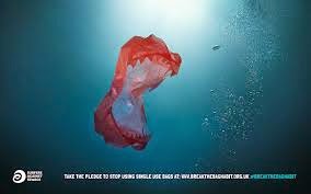
These are some of their posters:


No comments:
Post a Comment