Wednesday, 23 October 2013

Comparison of Photoshop and Illustrator


Photoshop

Things I prefer:
  • You can see the pixels and edit them in more detail
  • Has a better menu layout
  • Has a more professional looking layering system


Things I am not too keen on:

  • Some of the tools aren't as easy to access as they are on Illustrator


Illustrator

Things I prefer:

  • The layout of the tools are clear
  • You can have a larger variety of colour


Things I am not too keen on:

  • It is really simple to do something wrong, but it is a lot more difficult to put it back right.
  • You can't edit things in as much detail 


Which is better?

Well, for things, such as logo design, using Illustrator is better because it is like a piece of paper that you can draw on, where as Photoshop would be editing images into other images. Photoshop is formatted with pixels where as Illustrator uses vectors.


Why People Would use Each Program:

People who were editing real life photos would use Photoshop because you can make your photo more refined by editing pixel by pixel. If you were designing a logo, you would use Illustrator because it is more like paper and what you see, you get. Also, you can have access to a wider variety of colours.They would use Illustrator to create a logo, perhaps for a magazine, but they would also use Photoshop to edit a photo that would be going onto the front cover.

What I created:

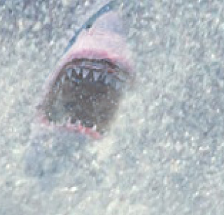
I created a logo timeline on Coca-Cola through Illustrator.I created a photo of a wave breaking and added in a shark, a starfish and a bird through Photoshop. 

What I learnt:

I learnt that layers are your best friend on both programs because if you go wrong, you always have them to fall back on.
I learnt that when doing a task through Photoshop, virtually anything is possible, no matter how outside the box it is. I also learnt that when using Illustrator, your possibilities are slightly more limited, but what you can produce is really cool.


What I enjoyed:

I enjoyed editing pixels and making an image that isn't meant to be there, look like it is meant to be there on Photoshop.

I enjoyed being able to make images cartoonish and surreal on Illustrator.

What I found challenging:
 I found the technique of manipulating things more challenging on Photoshop because some tools couldn't be used together when I needed them to. I found editing images in more detail on Illustrator more challenging because you can't see tiny details of the picture as easily as you can in Photoshop. 

In the Future:

On Photoshop I would like to learn how to change real images into cartoon images and on Illustrator I would like to learn how to revert problems more easily. I feel that in certain aspects of both programs I am confident, however, when it comes to future tasks, I may need help with new techniques.

Monday, 21 October 2013

My Final Design and Self Review


This is my final design that I created on Photoshop.


Self Review:


What is a composite image?
A composite image is an image that has been manipulated or modified with images from online.

How would you describe a surreal image?
I would describe it as an image that isn't real.

What new techniques did you learn on Photoshop today?
I learnt how to pull a layer through to the background by changing the brush's flow and opacity.

How successful was your example piece?
My piece wash;t too successful because I don't think I chose a good theme to do.

What would you do differently next time?
I would change my theme and spend more time making the photo's looking like they were meant to be there by zooming in to the pixels more and making it look more even.

How would it improve your final outcome?
It would make it more interesting and intriguing. It would also look more professional.


Eric Johansson Inspired Work


First, you add your photo into photoshop by dragging it onto the icon. This will then make this photo your background.


You do the same with the photos that you want to add to photoshop, but it will make t a layer, not a background. Use CMD+SHIFT and drag it onto your background so you can edit it.


This is now your first layer. you need to add this blank cover over it by clicking the icon that has a circle in the centre of it. When you click CMD+I, the photo will disappear.


This is your brush opacity and flow. You need to lower both of them to bring the photo through, whilst the cover is on the photo.


You will soon notice that the photo shows through and you can do this with any photo.


To add more images, you just need to repeat the process.

Tuesday, 15 October 2013

Wednesday, 9 October 2013

My final design

This is my final design that I created on Illustrator.

How I made my timeline on illustrator


First, I downloaded a Coca Cola font and typed the title.


Then, I added in my Coca Cola bottle and 'cartooned' the image for a better effect on the poster.
After that, I drew out the drop and coloured it a similar brown to Coca Cola.
I repeated this several times to give the effect that Coke was spilling out of the bottle.


Not long after doing this, I added the logos.
I then added the dates that went along with the logos.


After that, I added some information and opinions to the logos.

And finally, I added my review.

Monday, 7 October 2013

Final Design


Lesson 3


Lesson 2


Lesson 1


Peer Assessment - 07.10.2013


Peer Assessment (Assessing Chloe)

I think that Chloe has used the arc tool and the shape tool really creatively to create the effect of bubbles. I also think that the background is really well chosen and contrasts with the design she has chosen.

I think that Chloe has used illustrator in quite high quality because she has managed to use all of the basic tools to  a high standard. E.g: The font colour has changed as well as the style, the can has been well edited and is a smooth shape.

If I were to offer Chloe advice, I would say to make the text fit into the can more by making it smaller or having less text. I would also advise her to keep to the same font so it looks like it is all meant to be together a little bit more.